Multiple selection input field with search functionality using Shadcn/ui
Author: Vishnu Surendran
Published on: August 2, 2024
Greetings React developers. As we all know in web development a multi-select input field is an important thing to be implemented in most areas like login/signup forms and other information forms. As a React/Next.js developer, I have been using shadcn as my component library for the past few months. Shadcn provides a lot of reusable components that are built on top of radix ui. But recently, when I tried to implement a multiple-select input field inside my project, shadcn did not provide any component. So, I thought of building a custom multiple-select field component using shadcn. Finally, I found a workaround using some of the shadcn components to get the required multi-select input field. So let's get started.
Prerequisites
First of all, we need to install shadcn in our project. Since I'm using Next.js I’ll show you how to install this library on next.js. you can also visit the official website for more details about the installation for different environments.
npx shadcn-ui@latest init
To configure the components.json, you will be asked to answer the following questions
Which style would you like to use? › Default
Which color would you like to use as base color? › Slate
Do you want to use CSS variables for colors? › no / yes
And that’s it you've successfully installed shadcn. Now you can install the required components using the respective CLI commands
npx shadcn-ui@latest add button
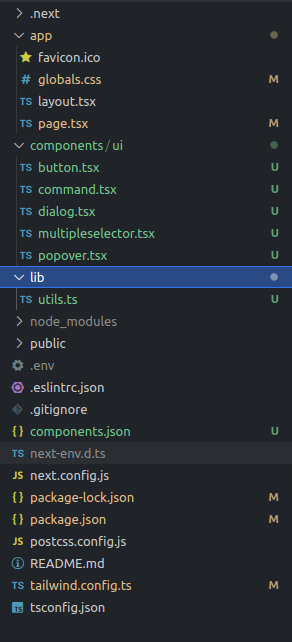
This will add the button components inside the ui folder. The shadcn components will be placed inside the folder components -> ui as shown below
For a more detailed installation guide, visit the below link
Implementation of the Multi-select input field with search functionality
Now let's create the multi-select input field. For that, we are using the shadcn combobox component. Combobox is a shadcn component that autocompletes input and command palette with a list of suggestions. The Combobox is built using a composition of <Popover/> and the <Command/> components. So we need to install these components first. For that follow the below instructions,
For adding the Popover component,
npx shadcn-ui@latest add popover
For adding the Command component,
npx shadcn-ui@latest add command
Now we have installed the required components let's add the combobox component, copy the below code, and create a tsx file inside the ui folder. something like multiselector.tsx. You can also find this code in the combobox section in shadcn.
"use client"

import * as React from "react"
import { Check, ChevronsUpDown } from "lucide-react"

import { cn } from "@/lib/utils"
import { Button } from "@/components/ui/button"
import {
  Command,
  CommandEmpty,
  CommandGroup,
  CommandInput,
  CommandItem,
  CommandList,
} from "@/components/ui/command"
import {
  Popover,
  PopoverContent,
  PopoverTrigger,
} from "@/components/ui/popover"

const frameworks = [
  {
    value: "next.js",
    label: "Next.js",
  },
  {
    value: "sveltekit",
    label: "SvelteKit",
  },
  {
    value: "nuxt.js",
    label: "Nuxt.js",
  },
  {
    value: "remix",
    label: "Remix",
  },
  {
    value: "astro",
    label: "Astro",
  },
]

export function ComboboxDemo() {
  const [open, setOpen] = React.useState(false)
  const [value, setValue] = React.useState("")

  return (
    <Popover open={open} onOpenChange={setOpen}>
      <PopoverTrigger asChild>
        <Button
          variant="outline"
          role="combobox"
          aria-expanded={open}
          className="w-[200px] justify-between"
        >
          {value
            ? frameworks.find((framework) => framework.value === value)?.label
            : "Select framework..."}
          <ChevronsUpDown className="ml-2 h-4 w-4 shrink-0 opacity-50" />
        </Button>
      </PopoverTrigger>
      <PopoverContent className="w-[200px] p-0">
        <Command>
          <CommandInput placeholder="Search framework..." />
          <CommandEmpty>No framework found.</CommandEmpty>
          <CommandList>
            <CommandGroup>
              {frameworks.map((framework) => (
                <CommandItem
                  key={framework.value}
                  value={framework.value}
                  onSelect={(currentValue) => {
                    setValue(currentValue === value ? "" : currentValue)
                    setOpen(false)
                  }}
                >
                  <Check
                    className={cn(
                      "mr-2 h-4 w-4",
                      value === framework.value ? "opacity-100" : "opacity-0"
                    )}
                  />
                  {framework.label}
                </CommandItem>
              ))}
            </CommandGroup>
          </CommandList>
         </Command>
      </PopoverContent>
    </Popover>
  )
}
This code just gives the combobox component, which is a select box with search functionality. But what we want is a multi-select input field with the search functionality. For that, we need to make some changes to the given snippet of code. So let's make the necessary changes.
First of all, we need to change the type of the given state variable from a string to an array and provide with initial value of an empty array. We will store the values of the selected options in this state variable.
const [value, setValue] = React.useState<string[]>([])
then for adding the selected values to the state variable, we need to update the onSelect function in <CommandItem>. Create a handler function called handleSetValue() as shown below,
const handleSetValue = (val: string) => {
    if (value.includes(val)) {
        value.splice(value.indexOf(val), 1);
        setValue(value.filter((item) => item !== val));
    } else {
        setValue(prevValue => [...prevValue, val]);
    }
}
This function will add the selected options to the array if it does not exist in the array else it will remove the value from the array. Now update the onSelect handler in <CommandItem>. Now the tag will look like this,
<CommandItem
    key={framework.value}
    value={framework.value}
    onSelect={() => {
        handleSetValue(option.value);
    }}>
    <Check
        className={cn(
            "mr-2 h-4 w-4",
            value.includes(framework.value) ? "opacity-100" : "opacity-0"
        )} />
    {framework.label}
</CommandItem>
To display the selected options in the select box we need to update the snippet inside the Button component as given below, you can play with this and make changes to match with your app’s UI.
<Button
    variant="outline"
    role="combobox"
    aria-expanded={open}
    className="w-[480px] justify-between"
>
    <div className="flex gap-2 justify-start">
        {value?.length ?
            value.map((val, i) => (
                <div key={i} className="px-2 py-1 rounded-xl border bg-slate-200 text-xs font-medium">{frameworks.find((framework) => framework.value === val)?.label}</div>
            ))
            : "Select framework..."}
    </div>
    <ChevronsUpDown className="ml-2 h-4 w-4 shrink-0 opacity-50" />
</Button>
Also don't forget to change the name of the component as per your requirement, say <MultipleSelector/>. Now import the MultipleSelector component to your page or component and run the project. Now you may face some issues,
Issue 1: The following error will be shown when you try to select the field.
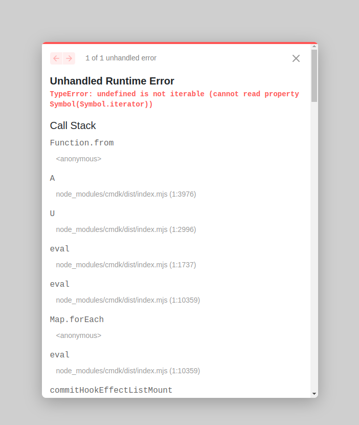
to fix this, locate the <CommandGroup> in multiselector.tsx file and wrap its contents inside <CommandList> as shown below
<CommandGroup>
    <CommandList>
        {frameworks.map((framework) => (
            <CommandItem
                key={framework.value}
                value={framework.value}
                onSelect={() => {
                    handleSetValue(framework.value)
                }}
            >
                <Check
                    className={cn(
                        "mr-2 h-4 w-4",
                        value.includes(framework.value) ? "opacity-100" : "opacity-0"
                    )}
                />
                {framework.label}
            </CommandItem>
        ))}
    </CommandList>
</CommandGroup>
Issue 2: The pointer events will be disabled for the options inside the field. Also, the options may appear as grayed out. You can fix this by removing a piece of code from the command.tsx component. For that, go to the command.tsx file inside the ui folder. Then search and locate the CommandPrimitive.Item, here you need to make some changes to the className property. Remove the following codes from the className
data-[disabled]:pointer-events-none
data-[disabled]:opacity-50
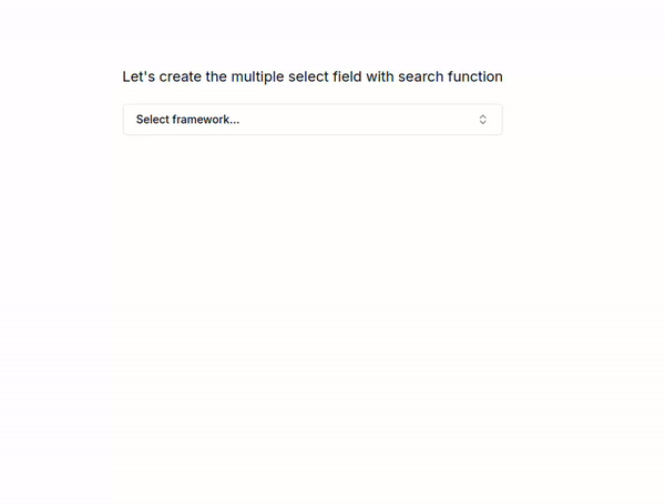
Now it is time to check the working of the component. A sample working video is shown below.
And, that’s it. Here is your multiple-select input field with the search functionality. You can get the selected field values in the value state variable as an array. Now you can use this component wherever you want. If you want to play around with component code you can check out the stackblitz playground .
References
nextjs
shadcn
shadcn-ui
react
reactjs